
Appearance
Navigation
The sidebar renders as Material's navigation drawer, collapsed as its navigation rail, and the topbar as its top app bar. Nothing here is a theme method; it all follows from the panel.
Sidebar
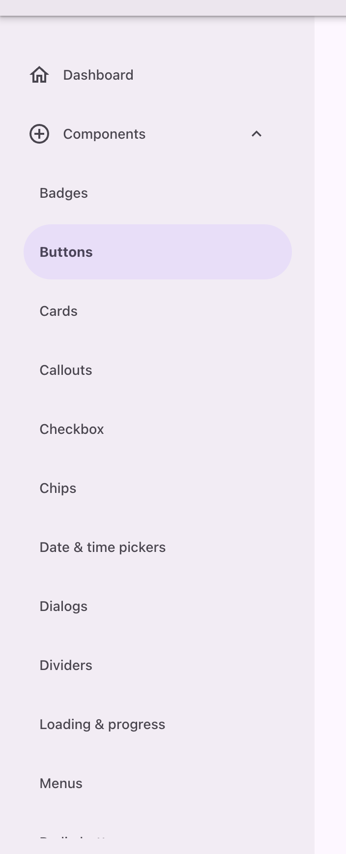
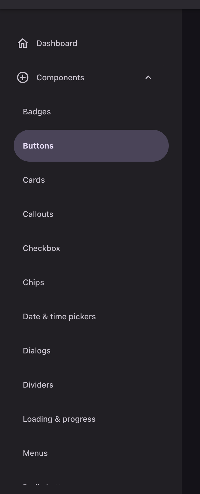
php
use Filament\Navigation\NavigationGroup;
use Filament\Support\Icons\Heroicon;

$panel->navigationGroups([
    NavigationGroup::make('Components')
        ->icon(Heroicon::OutlinedPlusCircle)
        ->collapsible(),
]);
The drawer is a sheet in the chrome tone with its trailing corners rounded, not a strip of the page. Each destination is a 56dp pill inset 12dp from the drawer's edges, and the active one sits on the secondary container with its label in the emphasized label style.
A collapsible group renders as a control with the same pill shape; one that is not renders as a section header.
An icon on the group means no icons on its items
Filament throws if a navigation group and the items inside it both carry icons.
Collapsed sidebar


php
$panel->sidebarCollapsibleOnDesktop();At 1024px and up the drawer collapses to Material's rail: an 88dp container holding 80x60dp destinations, each a 56x32dp indicator over a wrapped label. The indicator, not the whole row, is what carries the hover and active states.
A collapsed group opens its destinations as a sheet docked against the rail, full height and scrolling on its own, rather than as a floating dropdown:
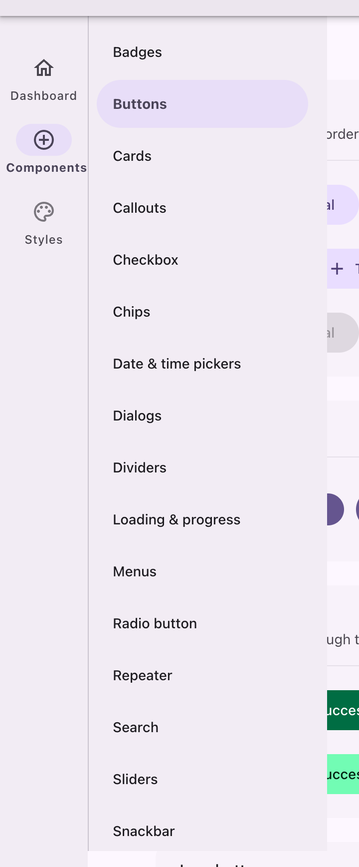
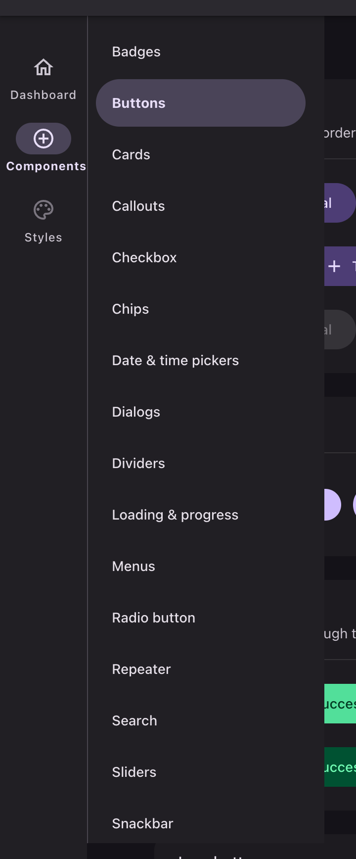
The rail gives up the corner it would cut into their seam, so the pair reads as one silhouette. Rows in the docked sheet are drawer pills, and the current one is read from aria-current rather than from a class.
Topbar




php
$panel->topbar(false);Material separates a top app bar from the page by tone alone, and only once content scrolls under it. At rest the bar shares the drawer's chrome tone with no divider and no shadow; scrolled, it moves one step up the container ladder and takes elevation 2. The flag that switches it is written on the document by the theme's script, so it survives Livewire swapping the panel's markup.
With a topbar present the drawer squares off and the rounding moves to the content tucking into the corner the two of them leave.
The bar's own controls, the user menu, tenant menu, theme switcher and sidebar toggle, are all fully rounded targets with a state layer, and an active topbar item takes the secondary container.
Page header
A page's heading is headline-small emphasized, its subheading body-medium on the variant ink. Breadcrumbs are body-medium on the variant ink, the last of them on the plain ink, with separators in the outline color.
API
| Method | Effect |
|---|---|
sidebarCollapsibleOnDesktop() | Lets the sidebar collapse to the rail at 1024px and up |
topbar(false) | Removes the topbar |
navigationGroups([...]) | Groups destinations; collapsible() makes a group a control |