
Appearance
Text input
A TextInput renders as a Material text field. Default variant: outlined.
Material recommends the filled field where one input has to pull focus. A panel is the opposite case, dozens of fields per screen, so the theme defaults to outlined and leaves filled to be asked for.
Variants
| Variant | Material name | Modifier | Container |
|---|---|---|---|
| Outlined | Outlined text field | none, or ->outlined() | Transparent, 1dp outline, 4dp corners |
| Filled | Filled text field | ->filledField() | Surface-container-highest, a rule underneath, top corners only |
| Search | Search | ->search() | Surface-container-high, fully rounded, 48dp tall |
Outlined
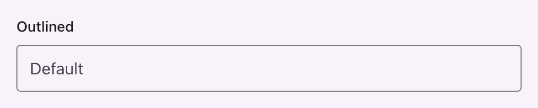

php
use Filament\Forms\Components\TextInput;

TextInput::make('name');
The outline turns to on-surface on hover and to primary on focus, where it doubles to 2dp.
Filled


php
TextInput::make('name')->filledField();The rule underneath grows from 1dp to 2dp and turns primary on focus, and error turns it red.
Search


php
TextInput::make('query')->search();Material's search is a pill on its own container tone rather than a text field, so the affix rule between a leading icon and the query is dropped: the icon and the text are one control.
The table's search field, a column's individual search field and the global search field all take this shape without being asked. See search.
variant() takes the same set by name:
php
use Saade\FilamentMaterialTheme\Enums\FieldVariant;

TextInput::make('name')->variant(FieldVariant::Filled);
TextInput::make('name')->variant('filled');| Case | Value |
|---|---|
FieldVariant::Outlined | outlined |
FieldVariant::Filled | filled |
FieldVariant::Search | search |
States
| State | What changes |
|---|---|
| Hover | The outline turns to on-surface; a filled field lightens with a state layer |
| Focus | The outline, or the filled field's rule, turns primary and doubles |
| Error | Outline, label, message and the filled field's rule all turn to the error role |
| Disabled | The outline drops to 12% of on-surface |
| Required | The mark beside the label takes the error role |
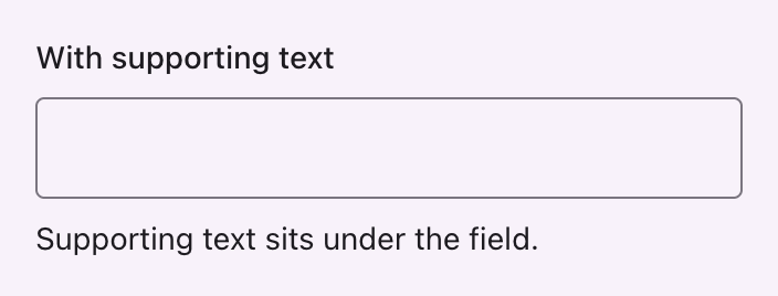

php
TextInput::make('name')->helperText('Supporting text sits under the field.');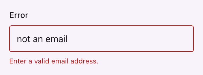
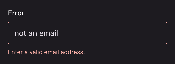
php
TextInput::make('email')->email();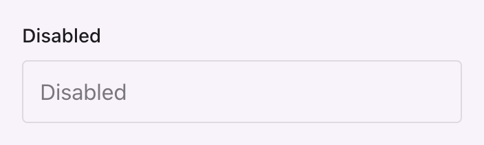

php
TextInput::make('name')->disabled();Affixes
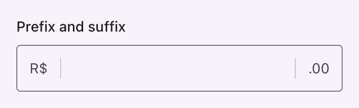

php
TextInput::make('price')->prefix('R$')->suffix('.00');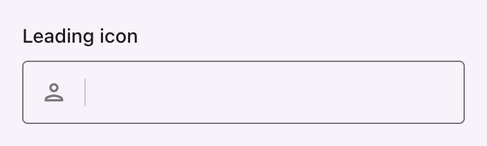

php
use Filament\Support\Icons\Heroicon;

TextInput::make('name')->prefixIcon(Heroicon::OutlinedUser);
Affixes take the variant ink and are ruled off from the text in the outlined and filled variants, which is the one part Filament and Material agree on.
One-time code
OneTimeCodeInput renders each digit as a small outlined field in headline-small, turning primary on focus.
php
use Filament\Forms\Components\OneTimeCodeInput;

OneTimeCodeInput::make('code');
Filament compatibility
label(), placeholder(), helperText(), hint(), prefix(), suffix(), prefixIcon(), suffixIcon(), disabled(), readOnly(), required(), autofocus(), type(), mask(), datalist() and the validation rules all behave as they do without the theme.
The variant is written to the field wrapper with extraFieldWrapperAttributes(), merged rather than replaced, so your own classes survive:
php
TextInput::make('name')
    ->filledField()
    ->extraFieldWrapperAttributes(['class' => 'my-wrapper'], merge: true);
API
| Method | On | Result |
|---|---|---|
outlined() | Field | Outlined text field |
filledField() | Field | Filled text field |
search() | Field | Search |
variant(FieldVariant|string) | Field | Any of the above by name |
Registered on Filament\Forms\Components\Field, so every form field takes them, not only the text input. On a field with no visible input wrapper, such as a checkbox, the class is set but nothing is drawn from it.
Why filledField() and not filled()
filled() is Filament's validation rule on a field, and the card variant on the schema component both descend from.