
Appearance
Buttons
An Action renders as a Material button. Default variant: filled.


Variants
| Variant | Material name | Modifier | Notes |
|---|---|---|---|
| Filled | Filled button | ->filledButton() | The default |
| Tonal | Filled tonal button | ->tonal() | |
| Elevated | Elevated button | ->elevated() | Carries a shadow, and raises it on hover |
| Outlined | Outlined button | ->outlined() | Filament's own method |
| Text | Text button | ->link() | Filament's own method |
| FAB | Floating action button | ->fab() | Turns on iconButton() |
| Extended FAB | Extended FAB | ->extendedFab() | Turns on button() |
php
use Filament\Actions\Action;

Action::make('save')->filledButton();
Action::make('draft')->tonal();
Action::make('export')->elevated();
Action::make('cancel')->outlined();
Action::make('learnMore')->link();
A plain Action::make() is already filled, so filledButton() is only needed to put a button back to filled when something else has changed it.
variant() takes the same set by name, for when the variant is data:
php
use Saade\FilamentMaterialTheme\Enums\ButtonVariant;

Action::make('save')->variant(ButtonVariant::Tonal);
Action::make('save')->variant('tonal');| Case | Value | Resolves to |
|---|---|---|
ButtonVariant::Filled | filled | A class |
ButtonVariant::Tonal | tonal | A class |
ButtonVariant::Elevated | elevated | A class |
ButtonVariant::Outlined | outlined | Filament's outlined() |
ButtonVariant::Text | text | Filament's link() |
ButtonVariant::Fab | fab | iconButton() plus a class |
ButtonVariant::ExtendedFab | extended-fab | button() plus a class |
With an icon


php
use Filament\Support\Icons\Heroicon;

Action::make('create')->icon(Heroicon::OutlinedPlus)->filledButton();
The icon takes the label's color rather than Filament's gray.
Disabled


php
Action::make('publish')->filledButton()->disabled();A disabled button that paints a container keeps one at 12% of the on-surface role, with its label at 38%. A text button, which paints nothing when enabled, paints nothing when disabled either. An outline is the exception Material makes: it holds its color in every state, disabled included.
Sizes


php
use Filament\Support\Enums\Size;

Action::make('xs')->size(Size::ExtraSmall);   // 28dp
Action::make('sm')->size(Size::Small);        // 32dp
Action::make('md');                           // 40dp, the default
Action::make('lg')->size(Size::Large);        // 48dp
Action::make('xl')->size(Size::ExtraLarge);   // 56dp
Not Material Expressive's ramp
Expressive publishes its own five sizes, from 32dp to 136dp, with 56dp as the medium. Adopting it outright would resize every button in the panel and put a 136dp button in a toolbar, so the ramp stays anchored on Filament's 40dp and takes its label styles from the type scale.
Colors


php
Action::make('save')->color('primary');   // the default
Action::make('approve')->color('success');
Action::make('review')->color('warning');
Action::make('delete')->color('danger');
Action::make('details')->color('info');
Action::make('dismiss')->color('gray');
Action::make('other')->color('secondary');
Each name resolves to a Material role rather than to a Tailwind ramp: danger is the error role, gray is the surface and on-surface-variant pair, and secondary is Material's secondary role even though Filament ships no such color. success, warning and info are added by the theme. See theming.
Colors and variants compose, and each variant reads a different part of the role: filled takes the accent, tonal takes its container, outlined and text take the accent as ink.


php
Action::make('approve')->color('success')->tonal();Icon buttons
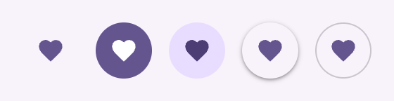

php
Action::make('favorite')->icon(Heroicon::OutlinedHeart)->iconButton();
Action::make('favorite')->icon(Heroicon::OutlinedHeart)->iconButton()->filledButton();
Action::make('favorite')->icon(Heroicon::OutlinedHeart)->iconButton()->tonal();
Action::make('favorite')->icon(Heroicon::OutlinedHeart)->iconButton()->elevated();
Action::make('favorite')->icon(Heroicon::OutlinedHeart)->iconButton()->outlined();
Standard is the default: no container, the icon on the on-surface-variant role. Sizes follow the button ramp, from 28dp through 40dp to 56dp.
Floating action buttons
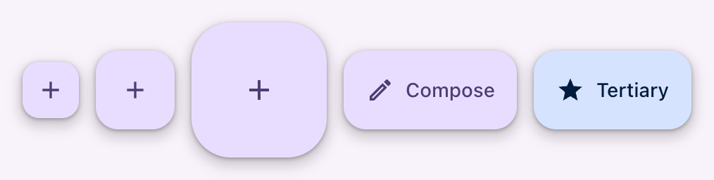
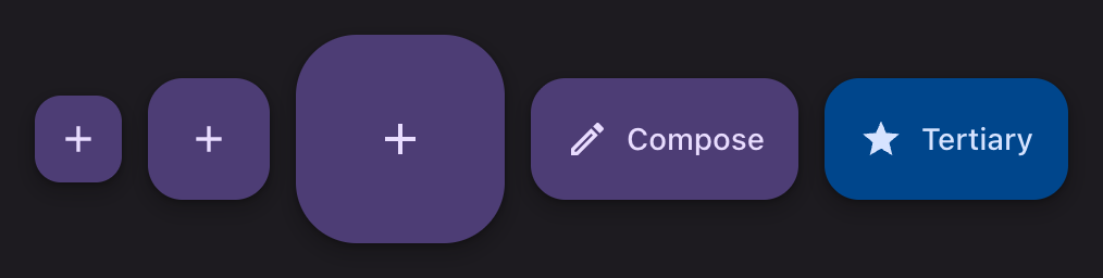
php
Action::make('compose')->icon(Heroicon::OutlinedPlus)->fab();
Action::make('compose')->icon(Heroicon::OutlinedPlus)->fab()->size(Size::Small);
Action::make('compose')->icon(Heroicon::OutlinedPlus)->fab()->size(Size::Large);
fab() renders as an icon button, so it needs an icon(). It sits on the primary container role at elevation 3, and raises to 4 under the pointer.
size() | FAB | Height | Corner |
|---|---|---|---|
ExtraSmall, Small | Small FAB | 40dp | Medium |
unset, Medium | FAB | 56dp | Large |
Large, ExtraLarge | Large FAB | 96dp | Extra large |
Extended
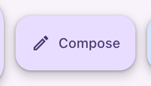
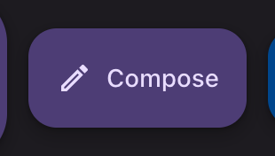
php
Action::make('compose')
    ->label('Compose')
    ->icon(Heroicon::OutlinedPencil)
    ->extendedFab()
    ->color('info');
extendedFab() renders as a labeled button, so it needs both an icon() and a label().
Filament compatibility
Nothing in the theme replaces Filament's own button API. color(), size(), icon(), iconPosition(), badge(), badgeColor(), tooltip(), disabled(), hidden(), visible(), label(), link() and outlined() all behave as they do without the theme. Two of them are reinterpreted rather than changed:
| Filament API | Reinterpreted as |
|---|---|
color() | A Material role, not a Tailwind ramp |
size() | A Material height, with the label style from the type scale |
badge() renders as a small pill on the button. See badges.
API
| Method | On | Result |
|---|---|---|
filledButton() | Action, ActionGroup | Filled |
tonal() | Action, ActionGroup | Filled tonal |
elevated() | Action, ActionGroup | Elevated |
fab() | Action, ActionGroup | FAB, rendered as an icon button |
extendedFab() | Action, ActionGroup | Extended FAB, rendered as a labeled button |
variant(ButtonVariant|string) | Action, ActionGroup | Any of the above by name |
Registered on the base Action, so CreateAction, EditAction, BulkAction and the rest all inherit them. An ActionGroup takes the same set, since a group renders as a button too.
Applied without being called: any action where isOutlined() is true is marked for the stylesheet, which is what makes an outlined icon button work, since Filament drops the flag when it renders one.
Why filledButton() and not filled()
filled() is the section variant, registered on the schema component. The theme keeps the three filled variants apart by name: filledButton() on an action, filledField() on a field, filledBadge() on a column or entry.