
Appearance
Modals
An action's modal renders as one of Material's three containers. Default: the dialog.
| Filament | Material name | Modifier |
|---|---|---|
| Modal | Basic dialog | none |
| Slide-over | Side sheet | ->slideOver() |
| Bottom sheet | Bottom sheet | ->bottomSheet() |
Dialog
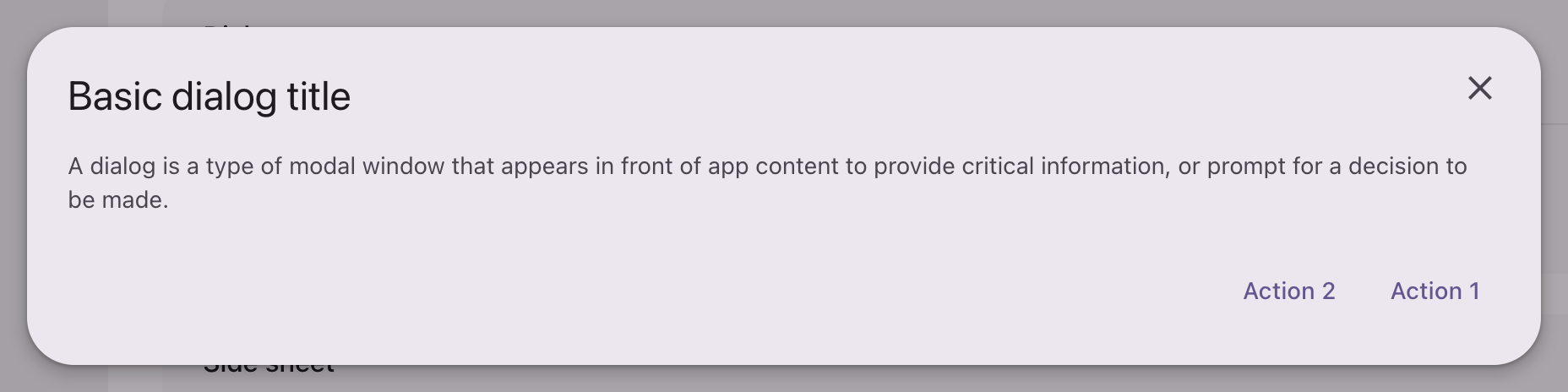
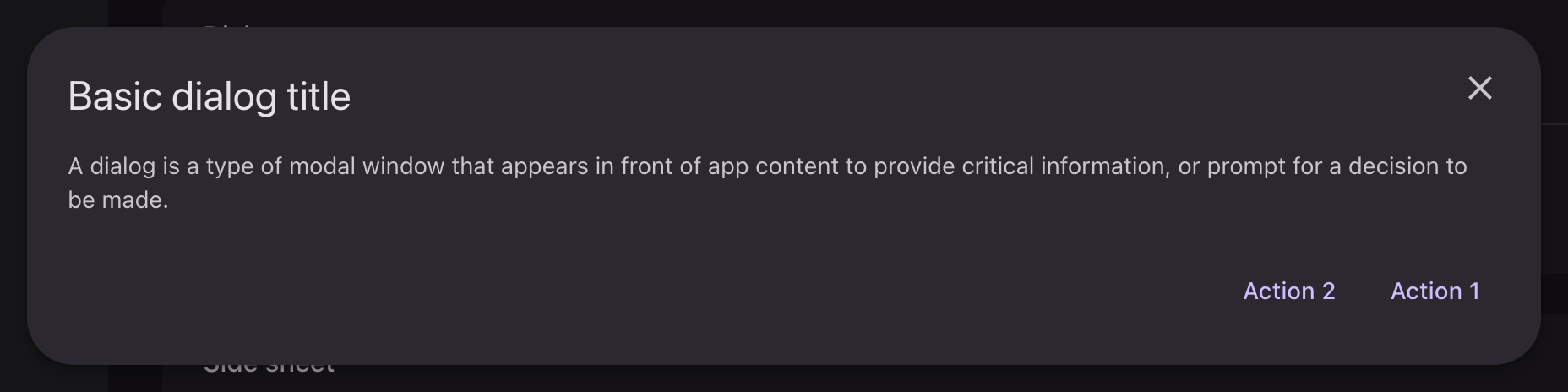
php
use Filament\Actions\Action;

Action::make('confirm')
    ->modalHeading('Modal title')
    ->modalDescription('A short line about what this modal is asking.')
    ->modalSubmitActionLabel('Action 1')
    ->modalCancelActionLabel('Action 2')
    ->action(fn () => /* ... */);
Surface-container-high at elevation 3, with 28dp corners. Three things differ from Filament:
- Footer actions are text buttons, gathered at the trailing edge.
- The one that submits is placed last, which is where Material puts the confirming action. Filament writes them in either order depending on the kind of modal, so the theme places by role rather than by position.
- A sticky header or footer takes the window's own container rather than a separate band.
With an icon
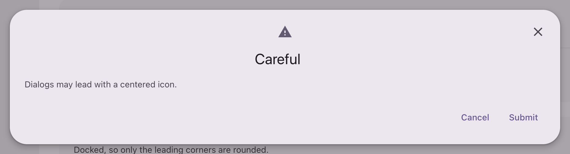
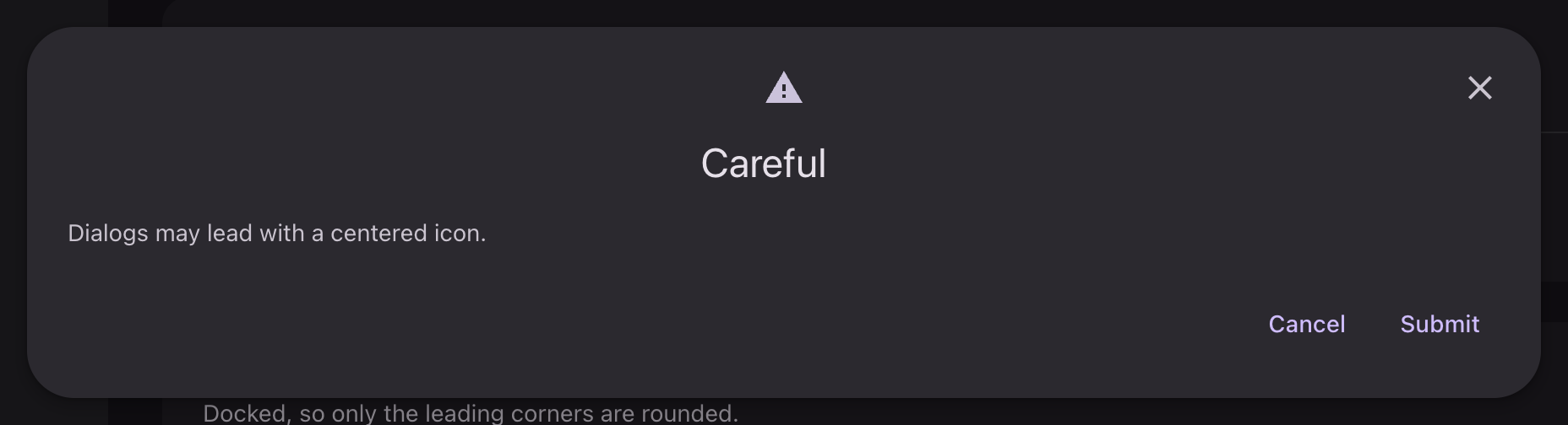
php
use Filament\Support\Icons\Heroicon;

Action::make('archive')
    ->modalIcon(Heroicon::OutlinedExclamationTriangle)
    ->modalHeading('Careful')
    ->modalDescription('This will archive the record.')
    ->action(fn () => /* ... */);
An icon stacks above the headline and both center, where Filament sets the icon beside it. The body stays start aligned and full width, so the block below the headline reads the same either way. The icon carries no circle of its own and keeps the secondary role even on a destructive modal, since the color is the headline's job.
Width
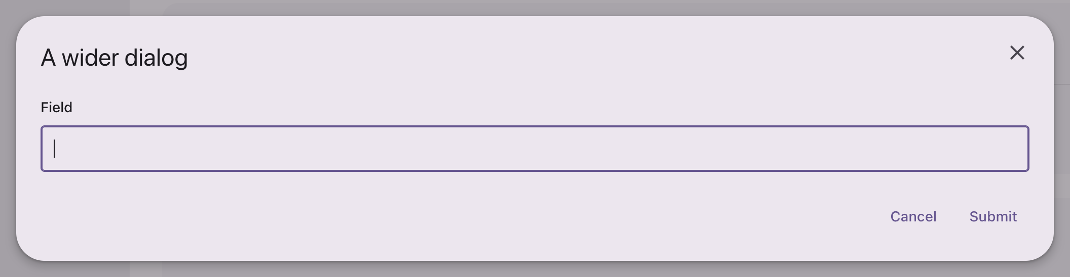
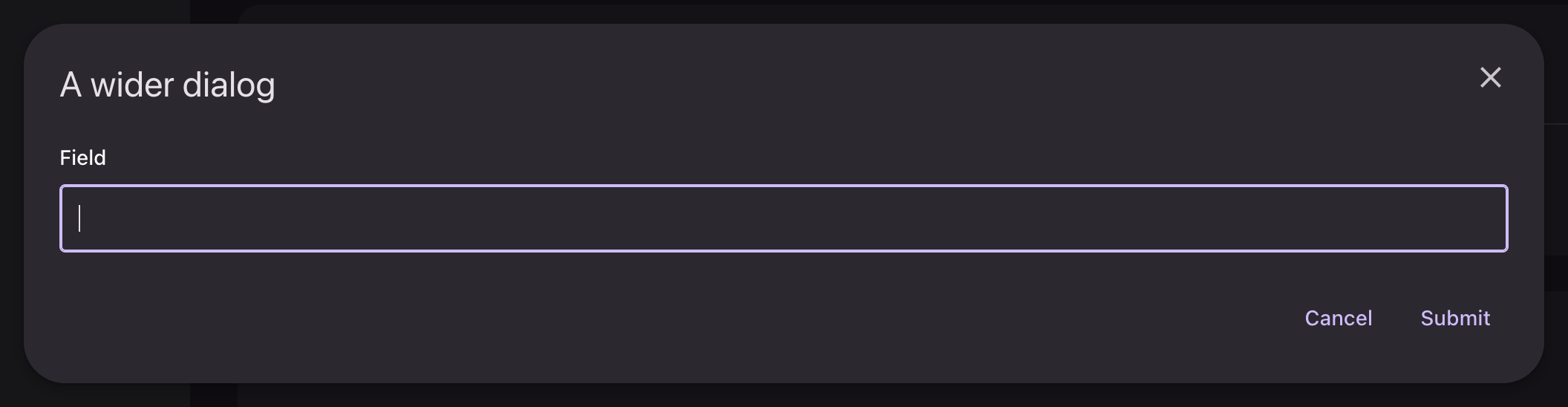
php
use Filament\Support\Enums\Width;

Action::make('edit')
    ->modalWidth(Width::FiveExtraLarge)
    ->schema([TextInput::make('name')])
    ->action(fn () => /* ... */);
Side sheet
php
Action::make('edit')
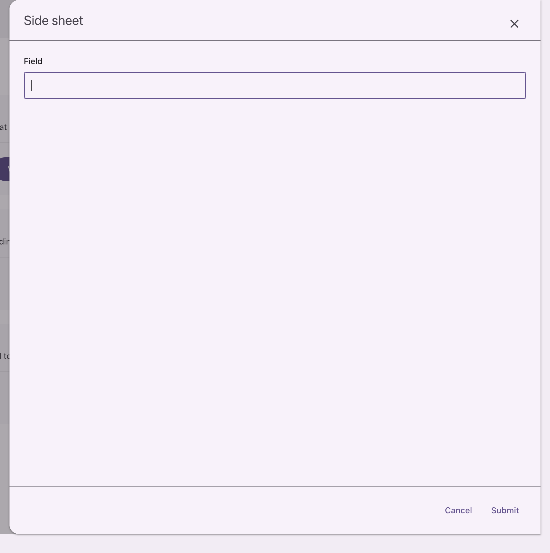
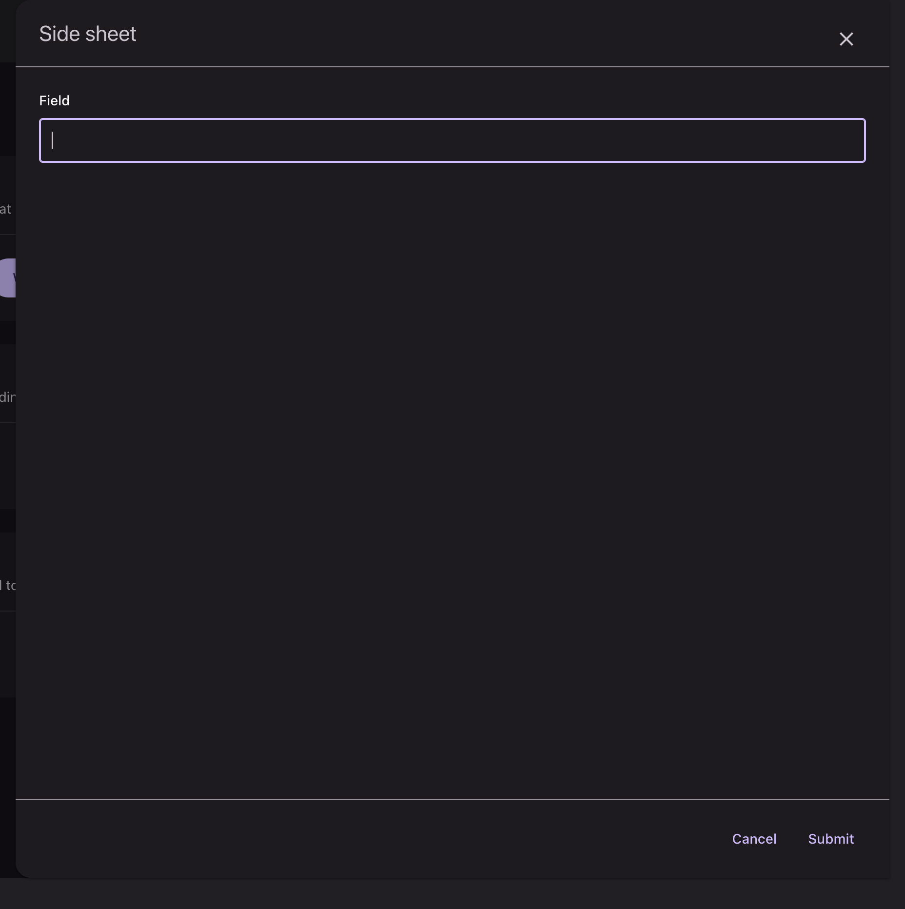
    ->slideOver()
    ->modalHeading('Edit record')
    ->schema([TextInput::make('name')])
    ->action(fn () => /* ... */);
Docked, so only the leading corners are rounded. Material specifies the side sheet apart from the dialog and it reads quieter for it: surface-container-low at elevation 1, its headline a title on the variant ink rather than a headline on the plain one.
php
use Filament\Support\Enums\SlideOverPosition;

Action::make('edit')->slideOver()->slideOverPosition(SlideOverPosition::Start);
Docking it to the other edge moves the rounding with it.
Bottom sheet
php
Action::make('edit')
    ->bottomSheet()
    ->modalHeading('Edit record')
    ->schema([TextInput::make('name')])
    ->action(fn () => /* ... */);
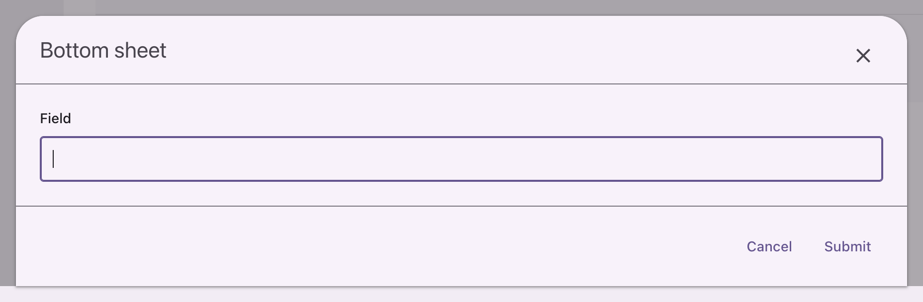
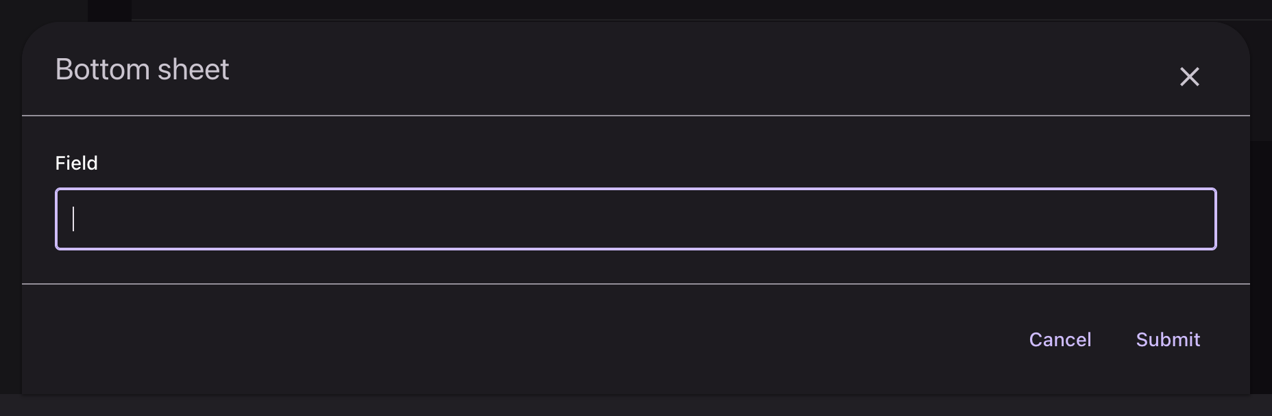
The same sheet against the bottom edge: full width, 28dp on the top corners, entering upward, and stopping at 92% of the viewport so a strip of the page stays visible behind it.
It takes a condition, evaluated every time the modal renders rather than once when the action is built:
php
Action::make('edit')->bottomSheet(fn (): bool => $this->isCompact);| Argument | Type | Default |
|---|---|---|
$condition | bool|Closure | true |
Passing false leaves the action as an ordinary modal.
It turns on slideOver() too
bottomSheet() calls slideOver() with the same condition, which is what gives it the sheet's header, close button and scrolling, and keeps it out of every centered-dialog rule. isModalSlideOver() therefore returns true for a bottom sheet, which matters if you branch on it.
Filament compatibility
modalHeading(), modalDescription(), modalIcon(), modalIconColor(), modalWidth(), modalSubmitActionLabel(), modalCancelActionLabel(), modalFooterActions(), stickyModalHeader(), stickyModalFooter(), requiresConfirmation(), slideOver() and closeModalByClickingAway() all behave as they do without the theme. bottomSheet() leaves modalWidth() alone, so the size stays yours to choose.
API
| Method | On | Arguments | Result |
|---|---|---|---|
bottomSheet(bool|Closure = true) | Action | Condition, evaluated per render | Bottom sheet |