
Appearance
Select
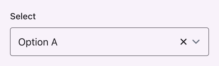
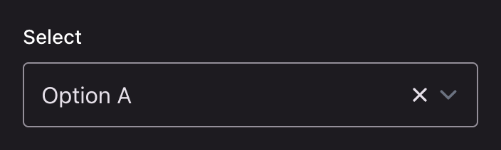
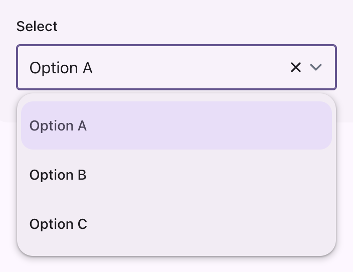
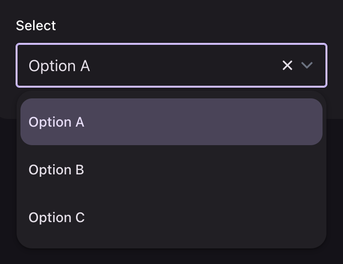
A Select renders its listbox as a Material menu, and its field as a text field.
php
use Filament\Forms\Components\Select;

Select::make('type')
    ->native(false)
    ->options([
        'a' => 'Option A',
        'b' => 'Option B',
    ]);
native(false) is required
Filament renders a native <select> by default, whose dropdown belongs to the browser and the operating system. No stylesheet can reach it. searchable() and multiple() imply Filament's own listbox, so they do not need it.
Behavior
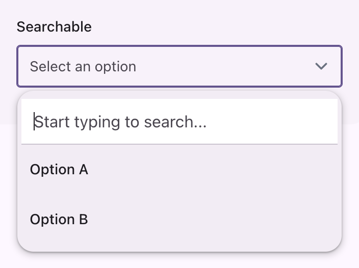
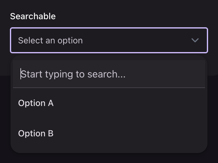
The panel is the menu sheet: surface-container at elevation 2, holding 48dp rows. The chosen option is marked with the secondary container rather than a check, which is how Material marks a selected menu item. The placeholder and the "no results" message take the variant ink.
Searchable
php
Select::make('type')
    ->searchable()
    ->options(['a' => 'Option A', 'b' => 'Option B']);
The search box at the head of the panel is divided from the options by a hairline.
Multiple

php
Select::make('types')
    ->multiple()
    ->options(['a' => 'Option A', 'b' => 'Option B']);
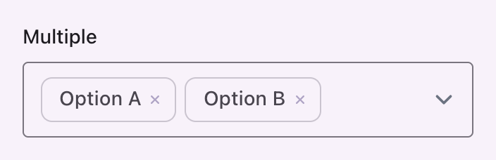
Chosen values render inside the field as outlined badges on the surface-container-low tone, each with a state layer on its remove button. TableSelect and ModalTableSelect render their chosen values the same way.
Filament compatibility
options(), searchable(), multiple(), preload(), relationship(), createOptionForm(), getOptionLabelFromRecordUsing(), disabled(), placeholder() and the rest behave as they do without the theme. The field takes the text input variants, since they are registered on every Field:
php
Select::make('type')->native(false)->filledField();