
Appearance
Customization
Everything the theme draws is bound to a custom property, so your own Blade views, widgets and plugin markup can sit on the same scheme rather than beside it.
Color roles
The runtime writes Material's full set of roles, in both modes, onto the document:
css
.my-panel-card {
    background-color: var(--md-sys-color-surface-container-low);
    color: var(--md-sys-color-on-surface);
    border: 1px solid var(--md-sys-color-outline-variant);
}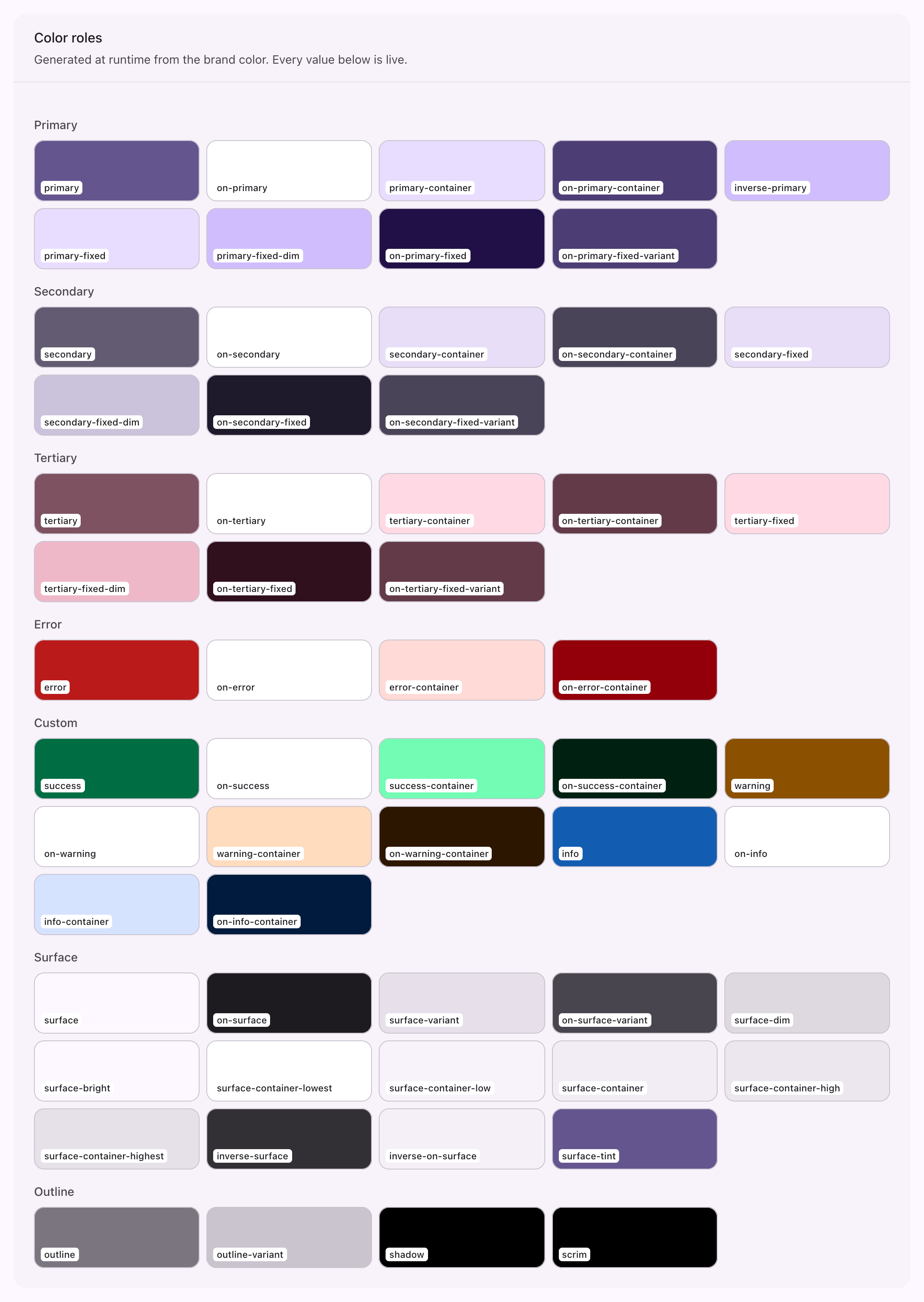
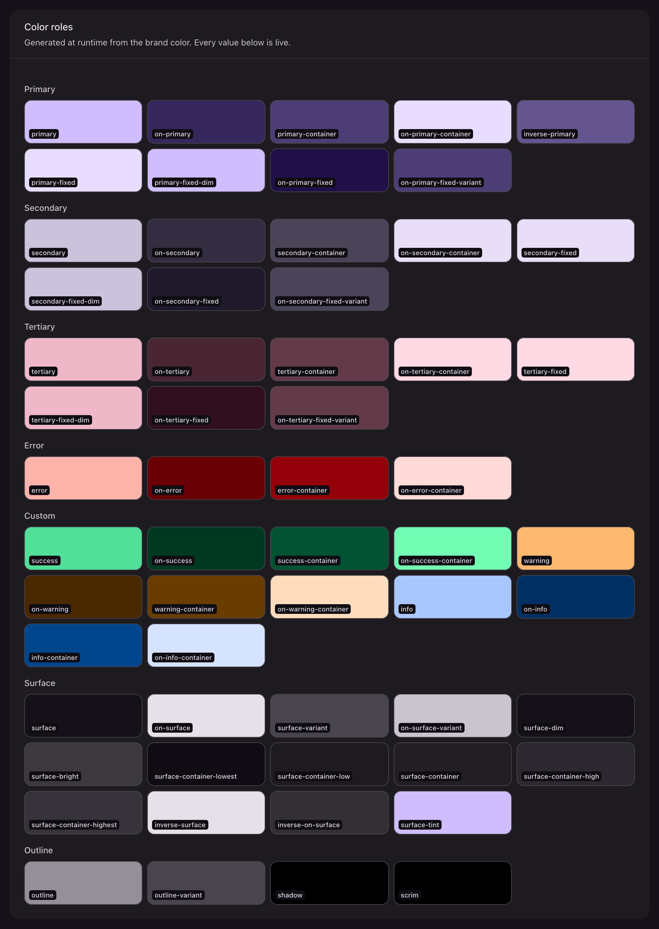
The names are Material's own: primary, secondary, tertiary, error, each with on-, -container and on--container pairs, plus the surface ladder (surface, surface-container-lowest through surface-container-highest, surface-variant, surface-dim, surface-bright), outline, outline-variant, inverse-surface, inverse-on-surface, inverse-primary, scrim and shadow. The theme adds success, warning and info in the same shape.
Four more name the layers a panel is built from, so a component can sit on the right one without knowing which Material role that is today:
| Property | Layer |
|---|---|
--md-app-chrome | The drawer and app bar |
--md-app-canvas | The content field |
--md-app-pane | A section, table or widget |
--md-app-pane-header | A summary row, a table's own header band |
Shape, elevation, motion and type
| Prefix | Values |
|---|---|
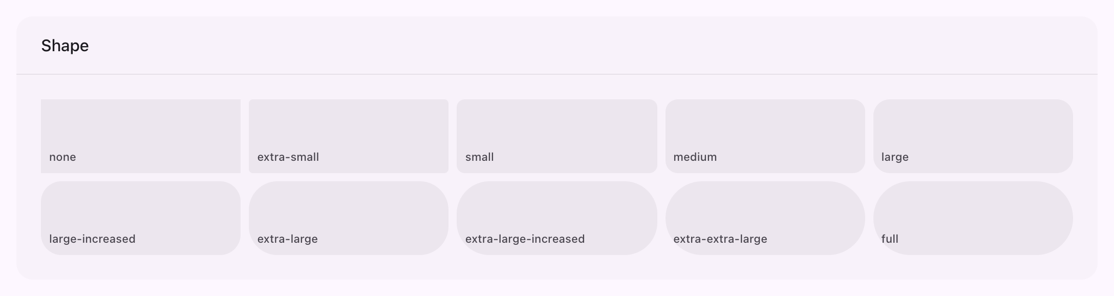
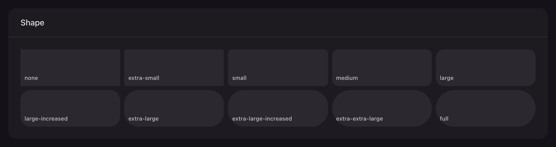
--md-sys-shape-corner-* | none, extra-small, small, medium, large, large-increased, extra-large, extra-large-increased, extra-extra-large, full |
--md-sys-elevation-level* | level0 through level5, as ready-made shadows |
--md-sys-motion-easing-*, --md-sys-motion-duration-* | Material's easing curves and durations |
--md-sys-typescale-* | Every style in the scale, as a font shorthand |
css
.my-panel-card {
    border-radius: var(--md-sys-shape-corner-large);
    box-shadow: var(--md-sys-elevation-level1);
    font: var(--md-sys-typescale-body-medium);
}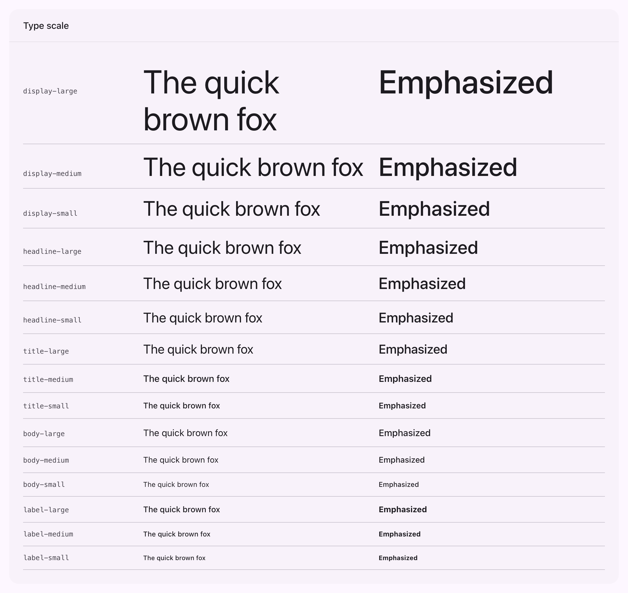
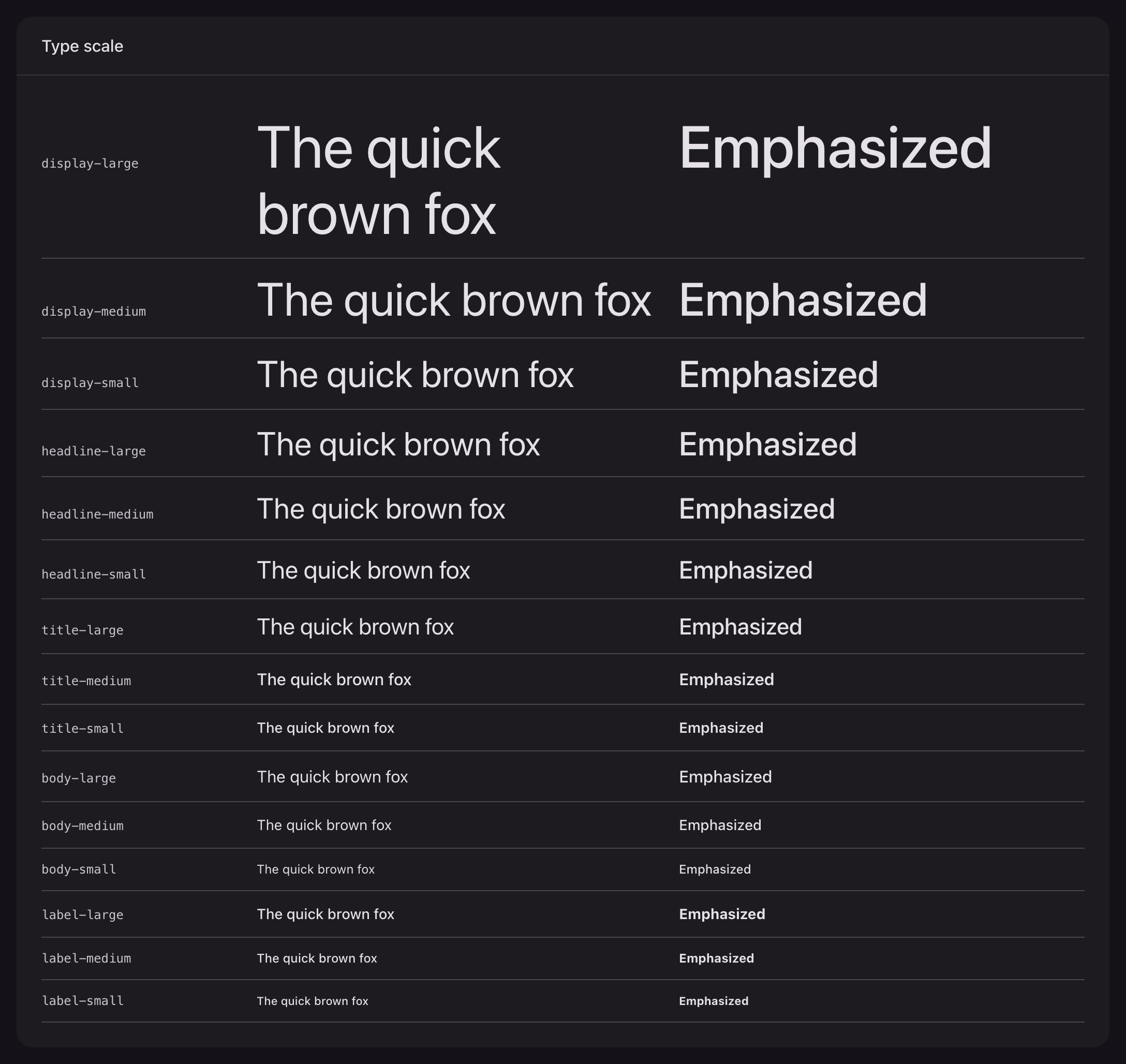
The type scale asks for Roboto Flex
It falls back to the system sans, and the package ships no webfont, so load Roboto Flex yourself if you want the exact scale.
State layers
Material expresses hover, focus and press as a translucent layer of the content color over the container. The theme exposes it as a Tailwind utility, driven by two properties:
css
.my-panel-row {
    --md-state-container: transparent;
    --md-state-content: var(--md-sys-color-on-surface);

    @apply md-state-layer;
}
md-state-layer-transparent is the same with the container already set to transparent. Both handle the disabled state as well, including Material's 38% content and 12% container opacities.
Filament's own variables
Filament reads --gray-*, --primary-*, --danger-*, --success-*, --warning-* and --info-* in several hundred declarations and expects a Tailwind ramp whose direction holds in both modes. The runtime rebuilds all six from the Material palette, so anything of yours reading them keeps working and follows the source color.
.fi-color-* classes are bound to Material roles as well, which is how ->color() on any Filament component resolves to --md-color-base, --md-color-on-base, --md-color-container and --md-color-on-container.
Replacing a rule
The theme is a stylesheet imported after Filament's, so your own rules win by being imported after it:
css
@import "../../../../vendor/filament/filament/resources/css/theme.css";
@import "../../../../vendor/saade/filament-material-theme/resources/css/theme.css";

.fi-btn {
    border-radius: var(--md-sys-shape-corner-medium);
}
Nothing in the theme is declared inside a cascade layer, so equal specificity plus later source order is enough. The five !important declarations in the package all sit in the collapsed sidebar's docked sheet, where they override inline styles Alpine writes as it opens.