
Appearance
Date-time picker
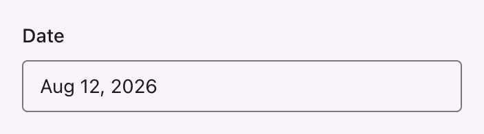
A DatePicker, TimePicker or DateTimePicker renders its panel as Material's docked date picker and time input.
native(false) is required
Filament renders a native input by default, which is the browser's own picker. No stylesheet can reach it.
Date

php
use Filament\Forms\Components\DatePicker;

DatePicker::make('published_at')->native(false);
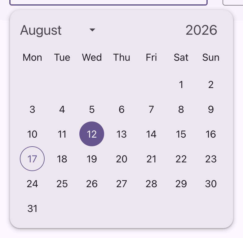
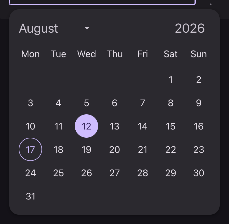
Each date sits in a 48dp cell holding a 40dp circular target, so a selection reads as a circle on the sheet rather than as a highlighted cell of a table. Seven of those give Material's 360dp container without the width being stated.
| State | Marker |
|---|---|
| Today | A ring in the primary color |
| Selected | Filled with primary, label on the on-primary role |
| Hover, focus, press | A state layer inside the circle |
The month is a select and the year a number input, both drawn as one title-large heading above the grid, with the select carrying Material's own drop-down arrow. The year input's spinner is removed, since it eats the last digit.
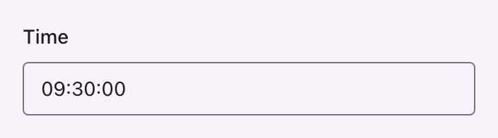
Time

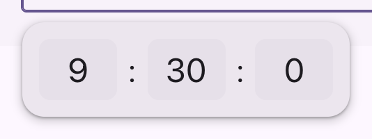
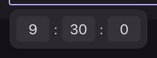
php
use Filament\Forms\Components\TimePicker;

TimePicker::make('starts_at')->native(false);
Material's time input: each part in a field of its own on the surface-container-highest tone, at headline-small, and the one being edited on the primary container. seconds(false) drops the third field.
Material draws these at 96x72dp and 57sp, which is the modal picker filling a screen of its own. Here they hang under a calendar in a dropdown, so the same component is taken a step down the scale.
Both


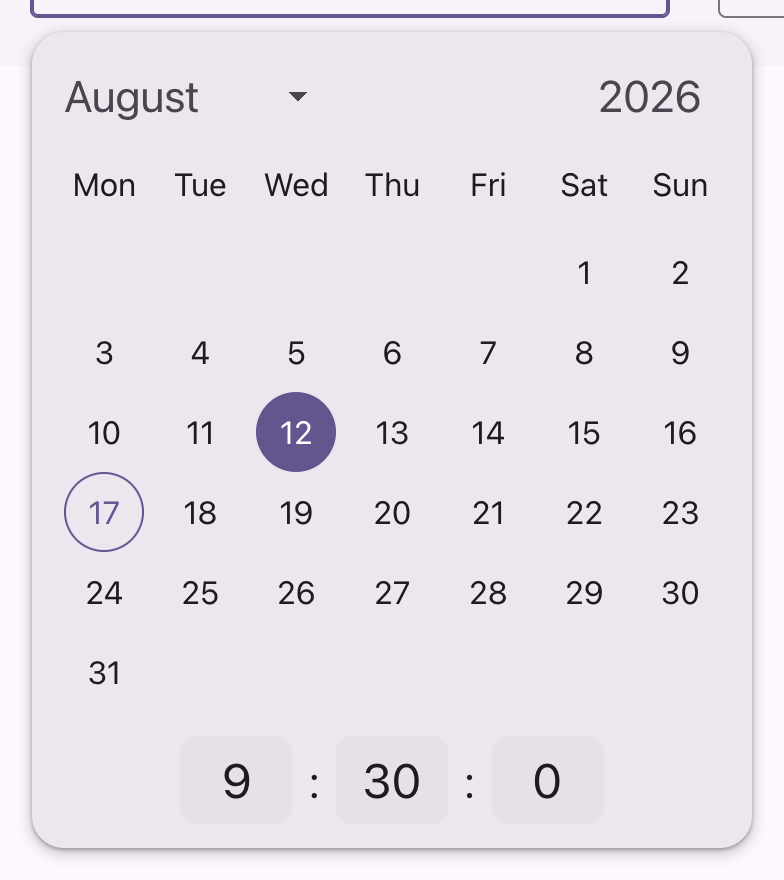
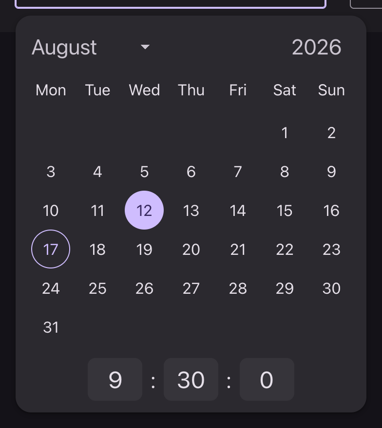
php
use Filament\Forms\Components\DateTimePicker;

DateTimePicker::make('starts_at')->native(false);
Notes
- The hour and minute fields show the value Filament puts in them, unpadded, so a single-digit hour reads as
9rather than09. - The field itself takes the text input variants.